Project
Brand Identity
Logo Design
Collateral Design
Social Media Templates
Brand System
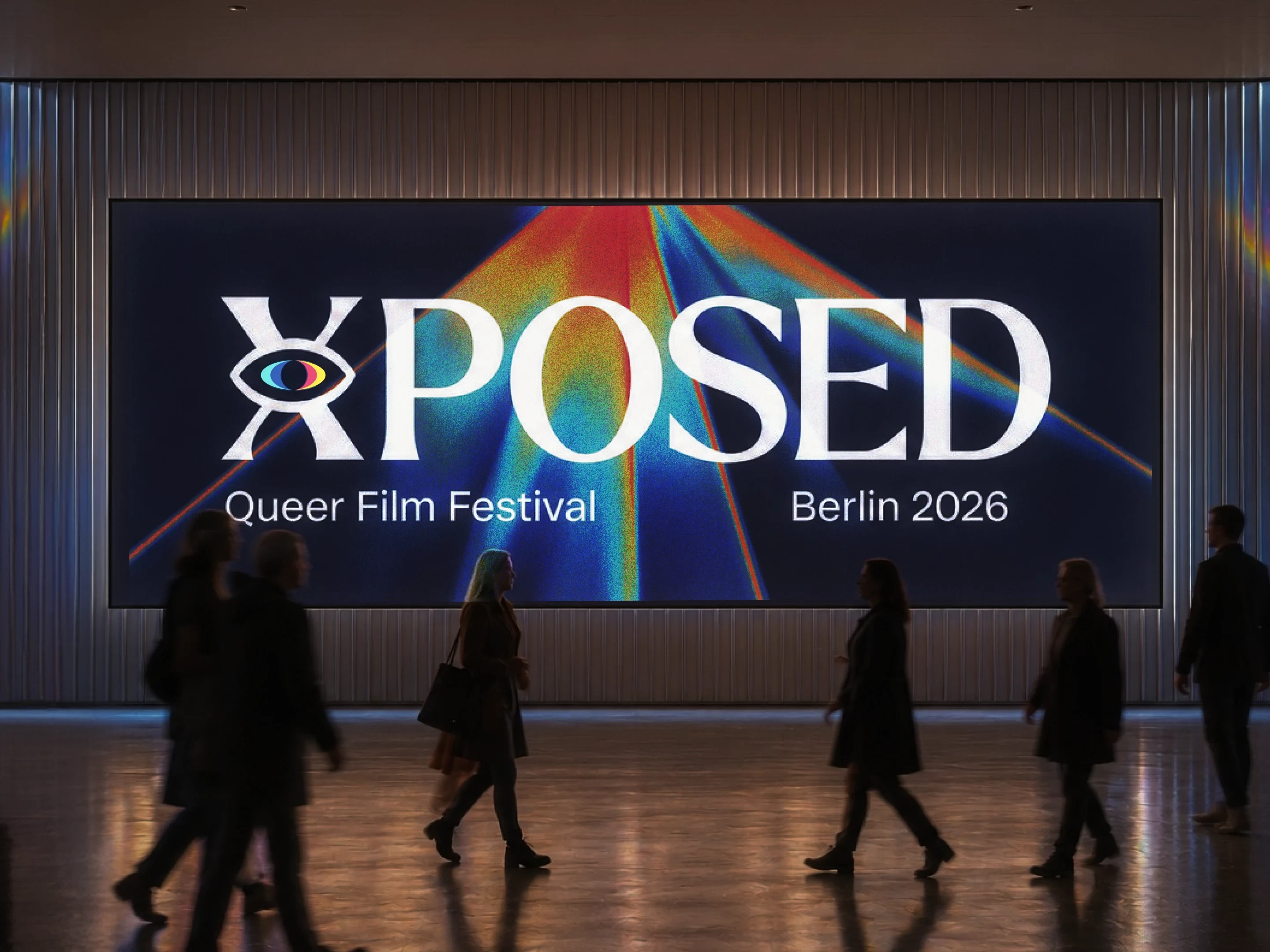


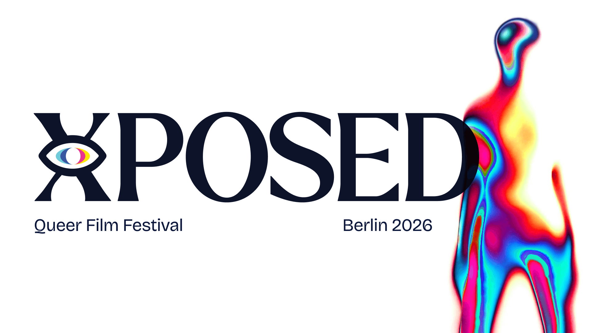
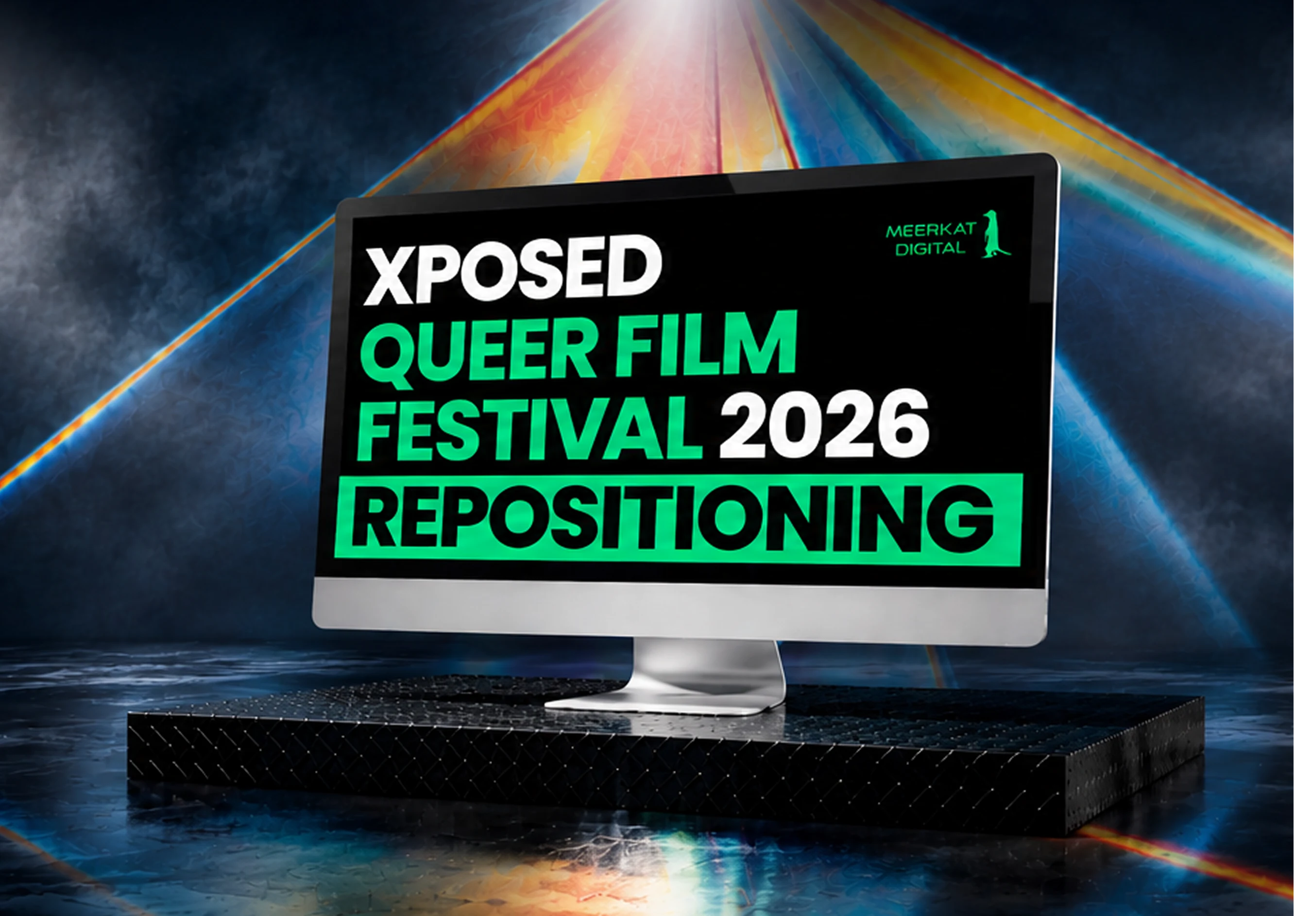
XPOSED’s initial directions were then turned into a moodscape: heatwave, inner light, & the energy of experimental cinema. An intense, curious, & slightly distorted identity: seeing through a queer lens.
This flexible brand through close collaboration & research insights works across the print, digital, merchandise, & festival touchpoints.
For a closer look into our research, visit the XPOSED Research.
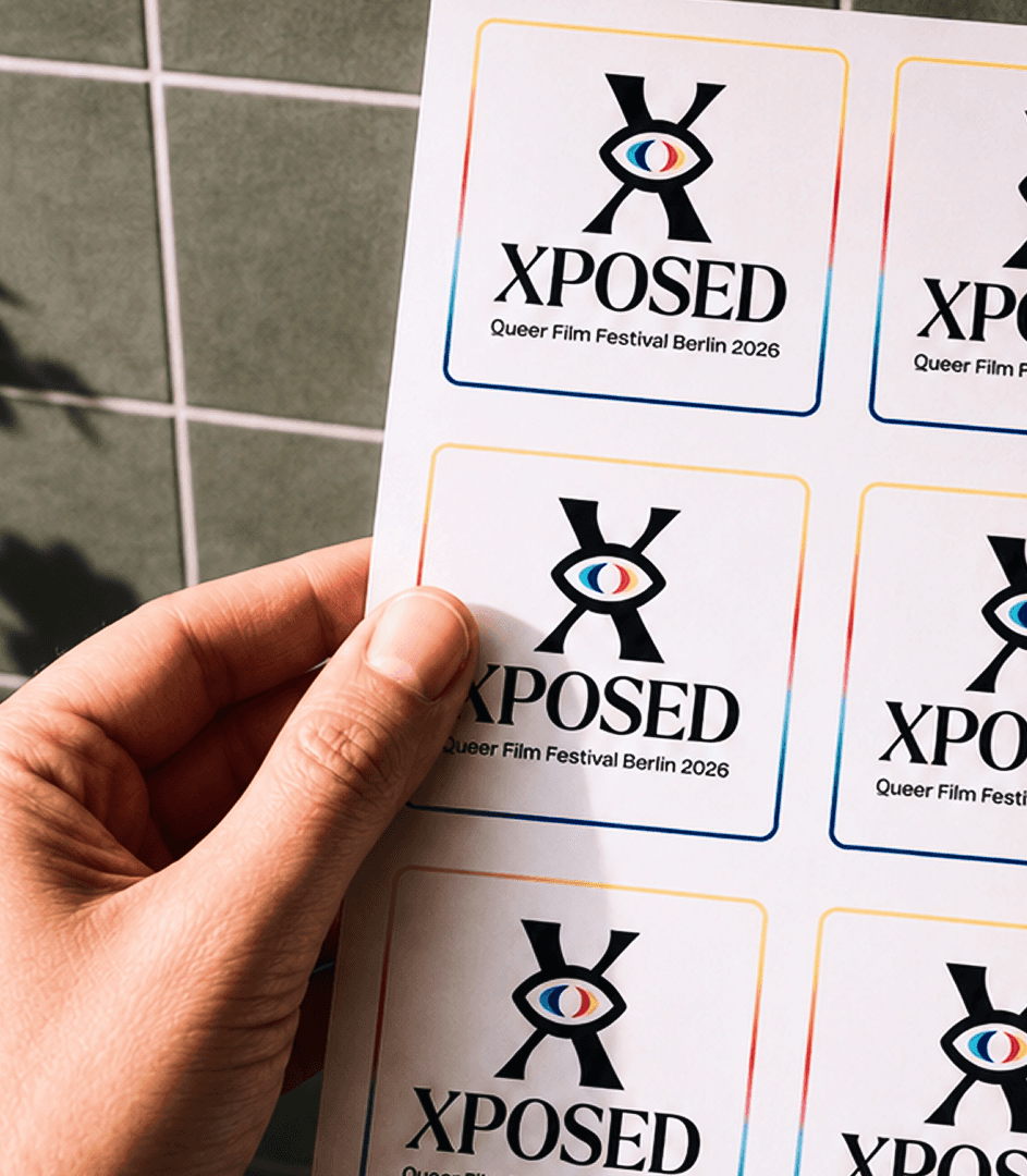
XPOSED wanted the “queer lens” direction pushed further. We kept one thing in the Meerkat pouch: the “X” in “XPOSED”. The queer lens, shown as an eye, & “X” gave us the new logo.
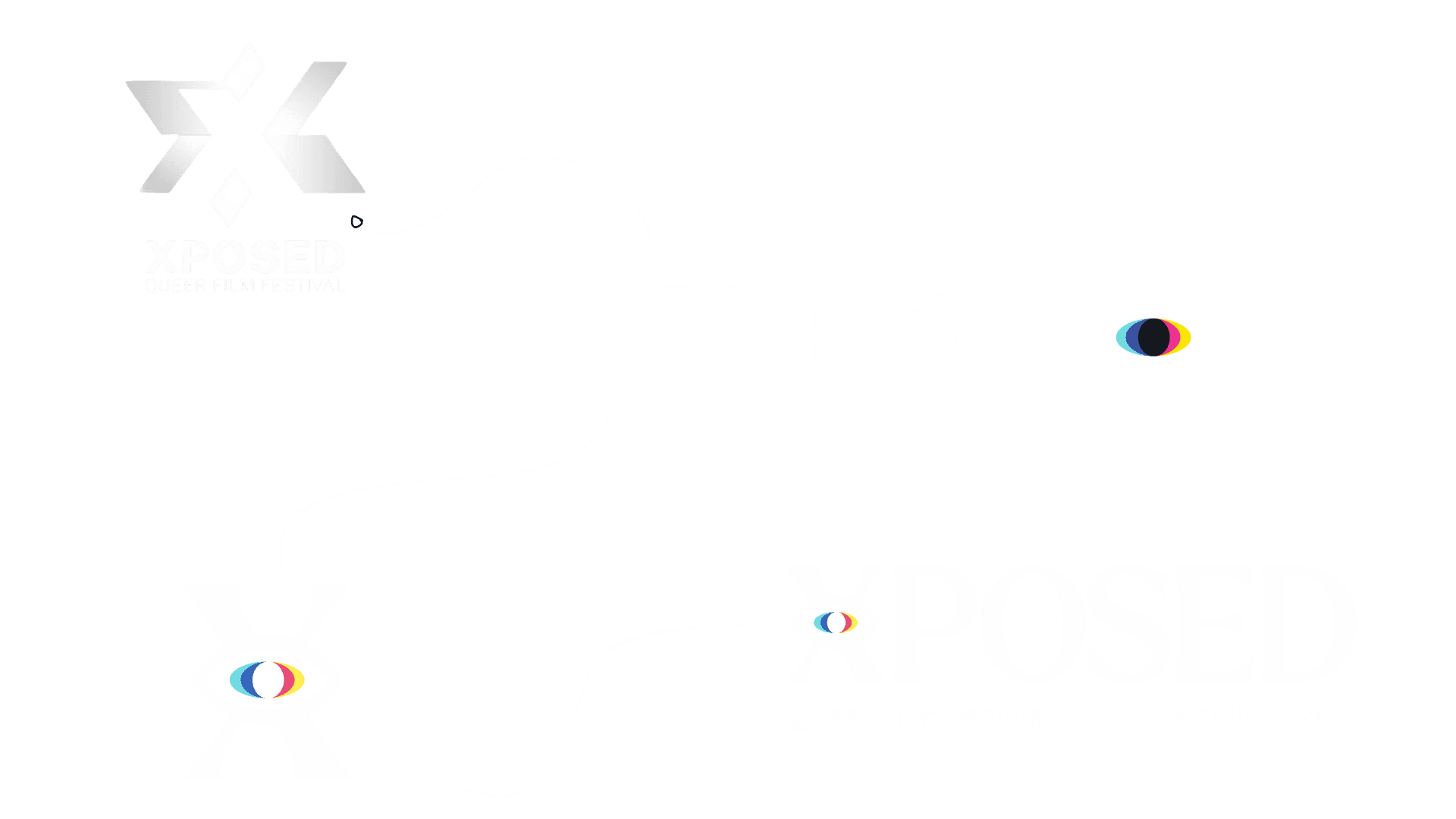
Then, a branding book, a consistent but flexible Meerkat map: logo rules, colors, typography, layouts, image direction, & brand applications.
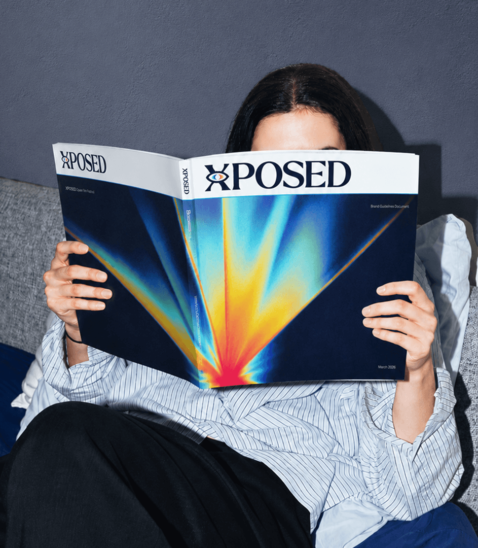
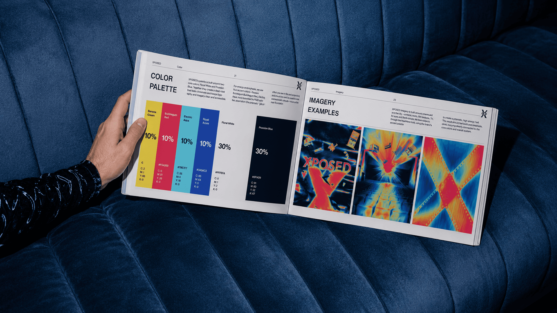
Print templates with bold layouts & a sharp type as a flexible system.
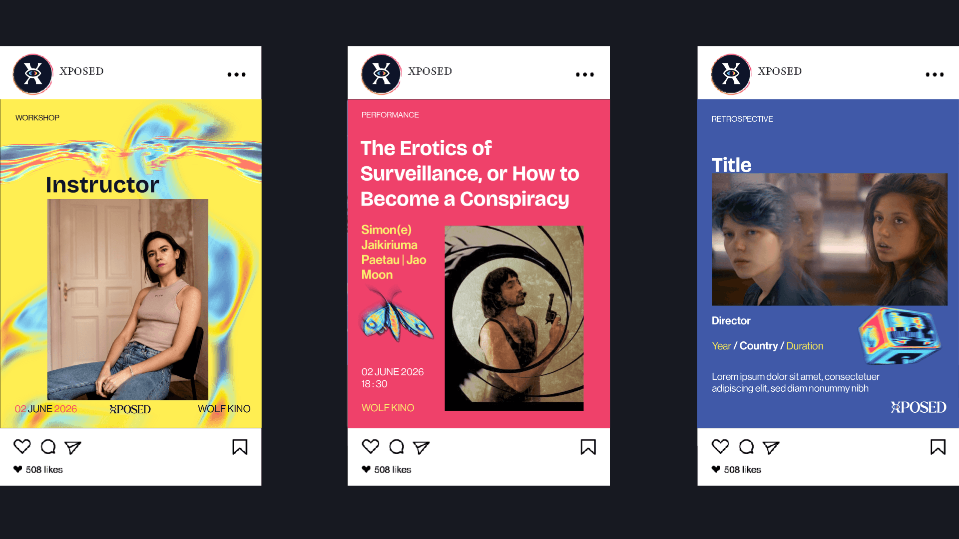
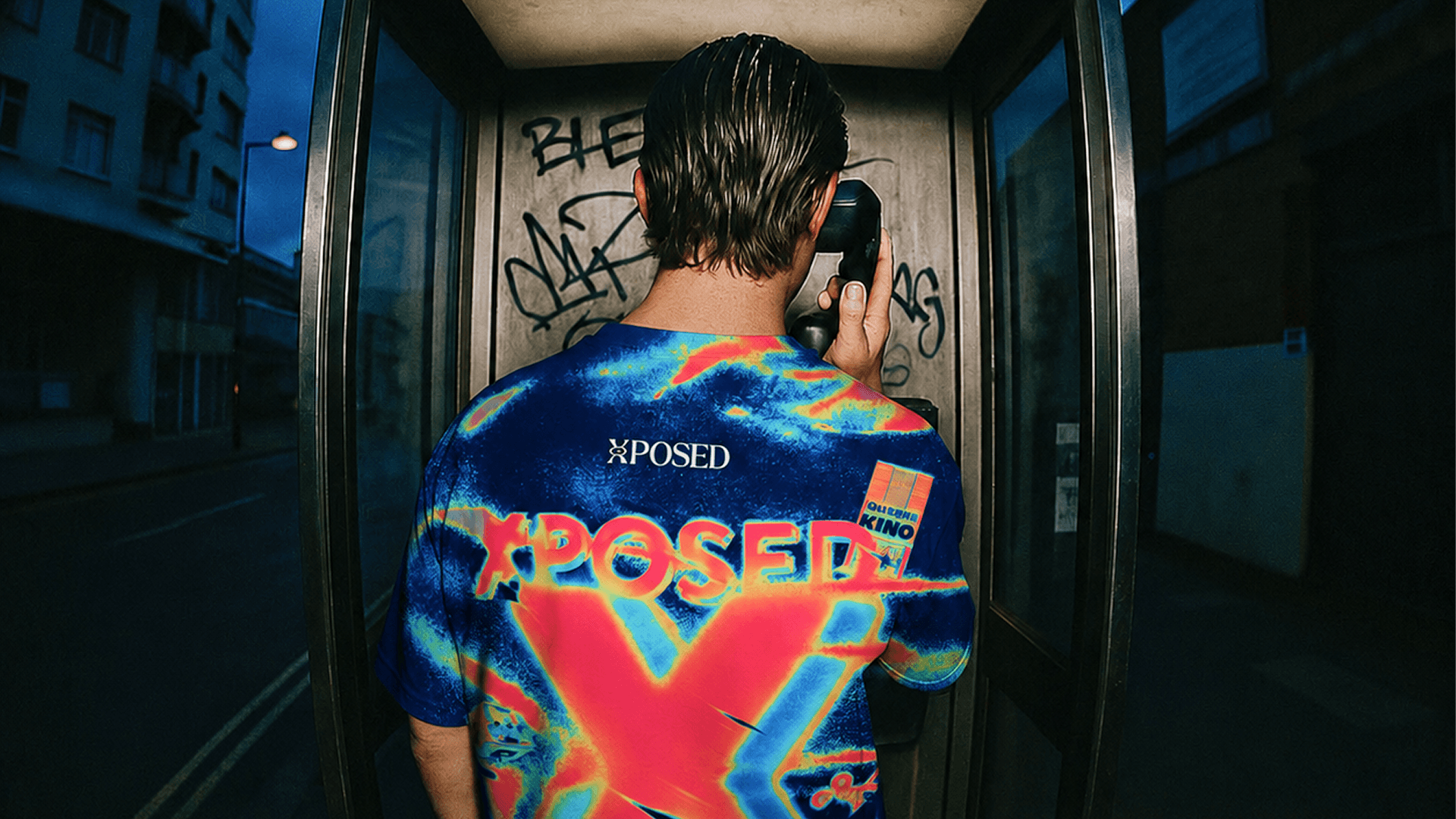
Social media templates mixing bright colors, strong typography, & cinematic distortion that pop, stick, & are hard to ignore.
Badges, stickers, & other merchandise brought the brand into the hands of the community. Small objects, big identity: little details with the Meerkat seal of approval.
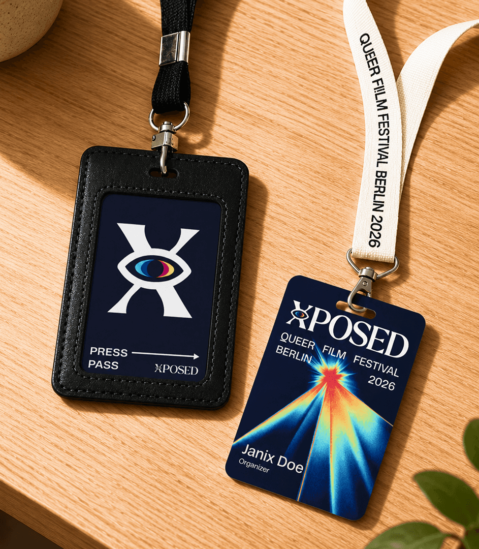
XPOSED’s fresh identity both embraces its legacy & starts a bright new chapter. Built with heart, queer vision, & a little Meerkat mischief, it’s loud, proud, & impossible to ignore.
Similar Projects